The Breath Between
Inhale. Pause. Exhale.
This was the underlying concept behind the creation of the visual identity for The Breath Between – an online community and wellness-focused fitness platform that values the importance of balance and pauses between life and time for yourself to move, rest or play.
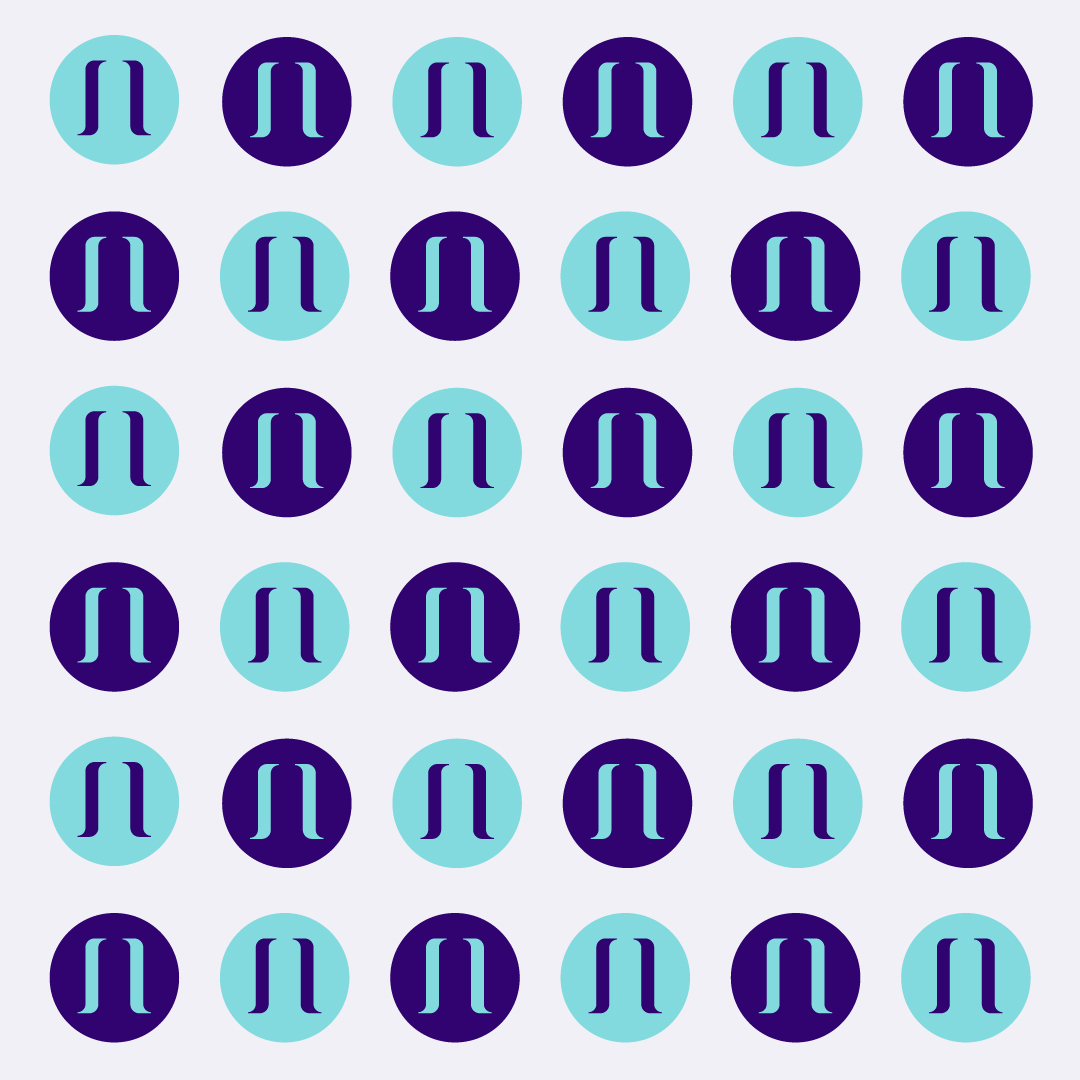
The “breath between” is literally the PAUSE between breaths – the moment to bring strength, calm and connection into your life. The graphic shapes also create a literal “PAUSE” button when pulled together and used as a secondary graphic.
The INHALE and EXHALE of a breath are represented with the gently swooping shapes on either side of the name – flowing upwards and then downwards. The name itself is held between these shapes – it becomes the PAUSE and moment of rest.


