Square Peg Psychology
In creating a logo and visual identity for Square Peg Psychology, we wanted to represent the client and her practice as one that values diversity, individuality and connection.
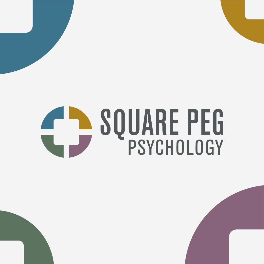
The concept of “trying to fit a square peg in a round hole” was our starting point – and really fun to explore such a visual idea.
This concept appealed to the client, both personally, as well as in the diverse types of clients she works with – who often feel like they are outside the “norm” or the status quo. There is a desire to be an individual but also the desire of belonging – and I wanted to explore how those two things can co-exist.
This graphic – a broken circle (or round hole) represents the idea of breaking the mold. You don’t need to fit into that standard shape – you can break it and find ways that you can exist in it too. The “square peg” sits comfortably in this new space that it has created for itself, without tension. It also speaks to the varying therapy offerings and willingness to find solutions that will work for each client.
The varying colours are a nod to the diverse range of groups the client works with, and the earthy tones keep it feeling warm, inviting and safe.